

.jpg)
PAST STUDENT WORK INSPO


This magazine has a striking and engaging colour scheme. The models have matched their outfits to the palette on the front cover and content page, this creates a cohesive and aesthetically pleasing page that draws in consumers. I want to create a similar, uniform magazine to make my work look as high end as possible. The contents also fit well with the music theme of this magazine, making it appear very authentic. The male models outfit is one which I believe I can follow, the baggy, oversized attire was trending back in the noughties.
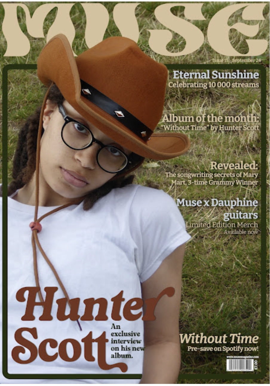


These two front covers both use their model as the focal point in their photo, the use of direct address also draws further attention. The colour palette of both is matched to the background and text on the magazine. this makes the covers look more aesthetically pleasing and high end. The contents page for the second magazine continues the green and white colour scheme, making it look more seamless when reading. I will incorporate this type of design into my own magazine to make it as aesthetically pleasing as possible.


No comments:
Post a Comment